A Not-So-Simple Redesign
 Jacky Gilbertson
For the past nine years, the web presence of silverorange has been simple. Our website consisted of a single page introducing ourselves in a brief paragraph and not much else. But it worked. Its simplicity exemplified our approach to our work: functional, straightforward solutions to complex problems.
But after almost a decade, it was time for a refresh.
That refresh is already up! Its creation was truly a team effort. We invited our entire design team to develop concepts for our redesign. And while we encouraged everyone to experiment, we wanted to keep the focus on the core concept of our previous design: simplicity.
Once we came together to share our concepts, we selected one design that worked best for our vision as the basis, then expanded on it with some of the other strong elements we liked from the other designs.
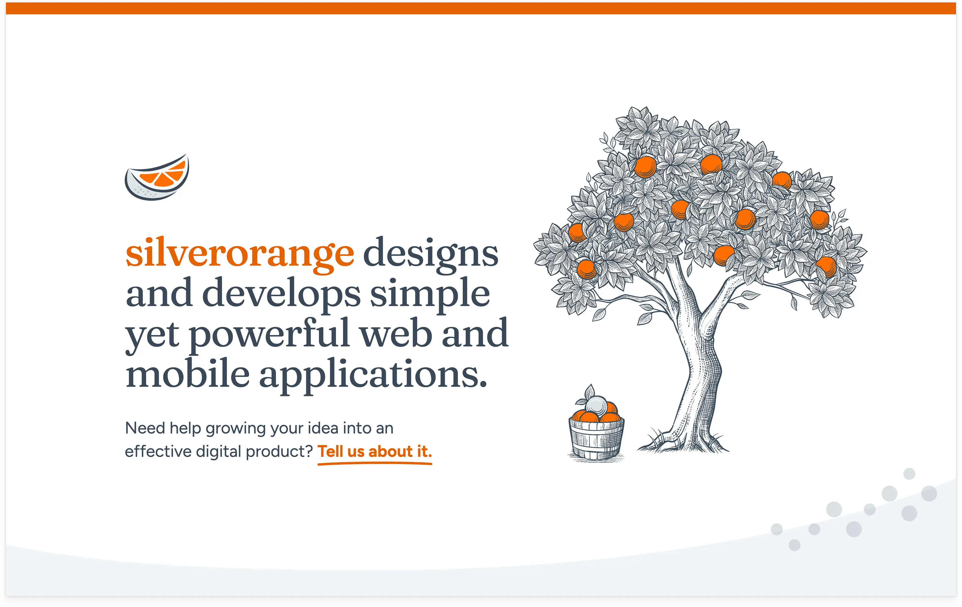
Light and classic with an academic feel, the keystone of this design was the illustrations. In addition to being one of the Senior Designers at silverorange, I am also a trained illustrator! The team asked me to share some insights into my inspiration and process.
Simple was how many referred to the previous iteration of the silverorange website, but I prefer to think of it as classic. It didn’t need to be constantly tweaked to keep up with the times, and it did its job without any extra doo-dads or fancy scroll jacking—it told people who we were and what we did. Nothing more, nothing less.
But as our company grew, our needs changed. And though we needed a refresh, I still wanted to preserve that ‘classic’ vibe. Whenever asked to ‘modernize’ something, most people focus on what’s new and trendy. But trends move fast, especially on the web, and something cutting-edge today can look dated in just a month or two.
So, instead of chasing trends, I looked back. Classic is classic for a reason—it never goes out of style. Something retro is retro regardless of what the year is, and I’ve always liked the vintage visuals of physical media applied to the web.
But how far back did I want to go? The earth tones of the Eighties would work well with the orange of our brand, but I didn’t think we were ready for a brown website (though I tried). Seventies typography is having a moment, but it’s teetering on trendy. Midcentury modern is always popular, but its popularity means it can feel overdone.
So I went further back. I’ve always loved the engravings of plant anatomy and scientific processes included in old academic textbooks. The sharp monochromatic illustrations complimented heavy text rather than overwhelming it, emphasizing function and exuding knowledge and expertise. That was a concept that suited us well.
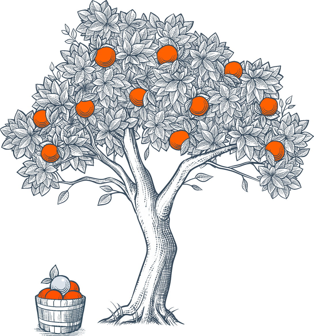
The style now chosen, I needed to figure out what to draw. The orange tree and the basket was the first idea—it played well with the academic illustrations from which I drew my inspiration—but drawing more and more oranges grew tired. After all, we make websites, not juice.
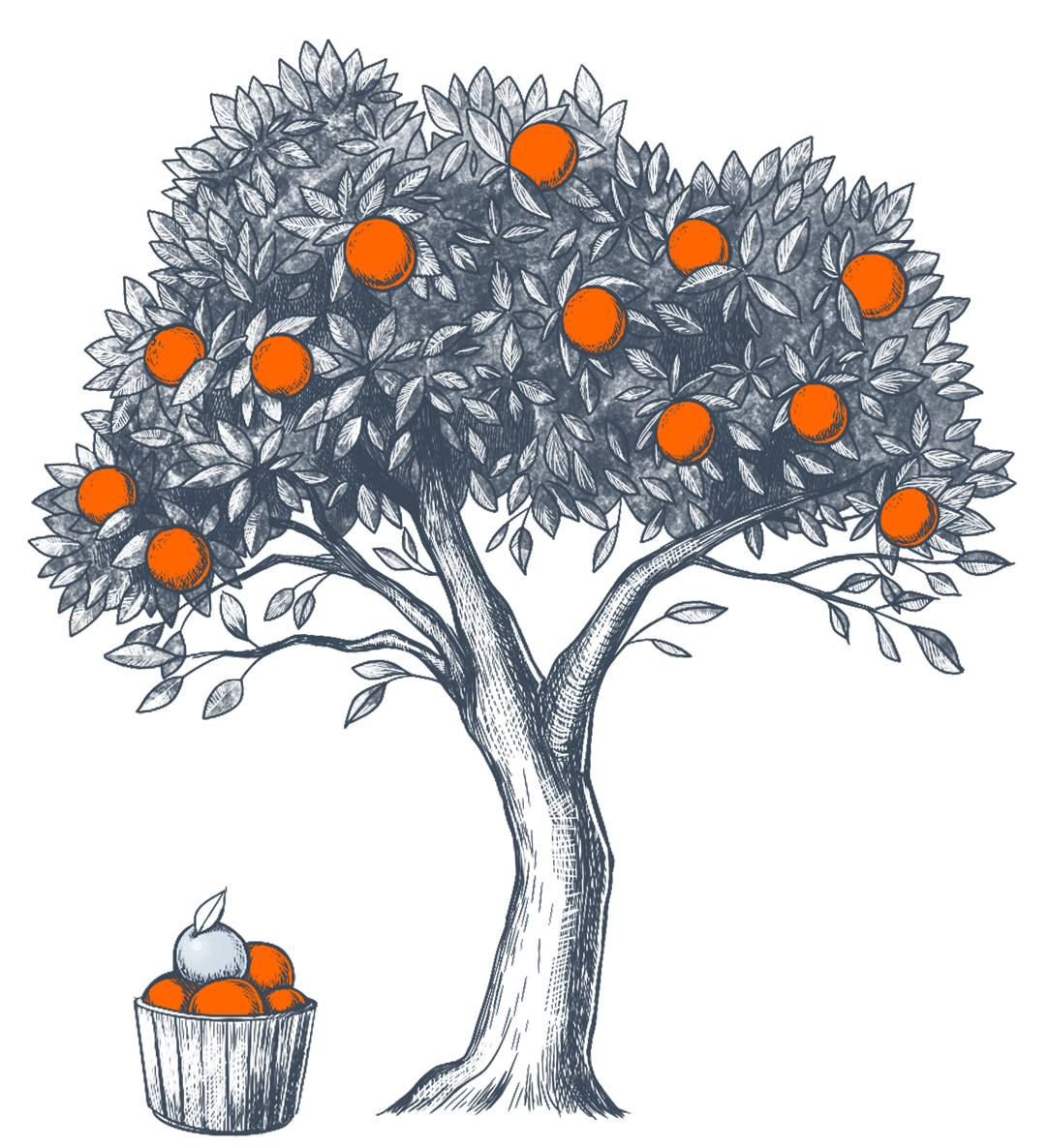
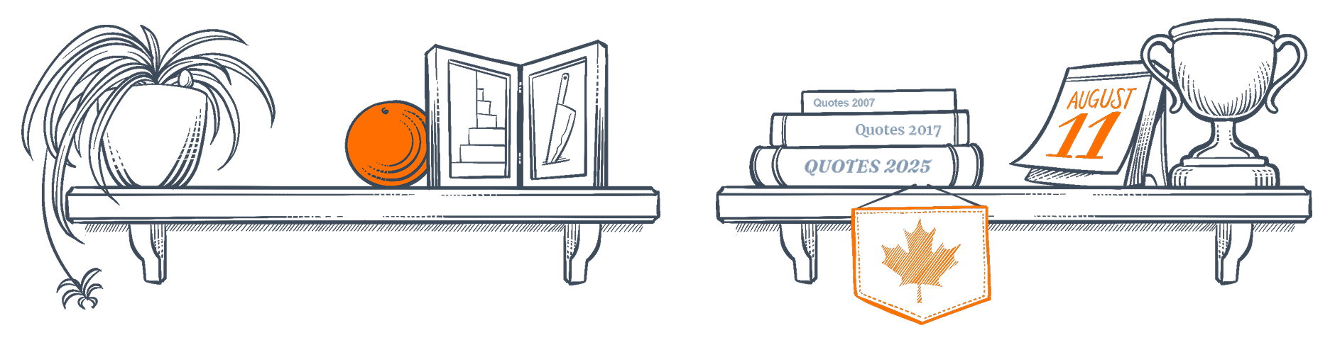
But wanting to keep the illustrations in the same ‘world’ as our tree, I tried to root (ha) the other drawings in a shared physical realm. If the tree was in our ‘yard’ what was in our ‘house’? I began to sketch frames with art representing our clients and past work, and shelves laden with silverorange ephemera.
Some choice bits include:
- Our beloved ‘Murder Stairs.’ These are the semi-perilous steps of our remodelled Victorian house-turned-office. Living up to their name, they were once accidentally impaled by a knife (though the knife was for cake, not murder).
- A literal Easter Egg. A few years back, the team in Charlottetown held an Easter Egg hunt in our office-house, but not every chocolate egg was found. We are still discovering them to this day.
- Books of ‘quotes’ from our storied history. To amuse ourselves, we capture our pithiest comments in a dedicated Slack channel to laugh at later, as the lack of context makes them funnier.
Once I had the sketches ready, I worked on cleaning up the style. The style needed to be cohesive and replicable so that if I came back in a year or so, I could create more illustrations that matched the others. I kept the drawings strong and sharp and mostly monochromatic, with only a touch of orange—and silver—here and there for pop.
The illustrations finalized, I passed them along to our dev team. I worked with our Creative Director Steven to split the illustrations into components so we could include some subtle animations. And with that, I could sit back and watch our talented developers bring my designs to life. We’re quite happy with the result, and we hope you like it, too.
Hopefully this version lasts just as long as the previous one.